How to Draw a Map that Pops Off the Page

I recently spent some time drawing a few maps and thought that I would share my technique. It is quite simple and does not require much skills or practice. I bet you will be surprised by how easy it is.
Supplies
- Winsor & Newton ProMarker, Ice Grey 4
- Blank Ink Pen 005 and 05
- Some colored pencils
- A pencil
- Card stock paper
I provided some links above, but any colored pencils, and correctly sized pens will work. In the pictures you will see a Prisma Color 05 black ink pen because that is what I had available. It is important that the grey marker is partially see through for shading purposes. For that one I would suggest sticking with the link I provided.
Step 1: Pencil Outlining
Avoid pressing too hard with the pencil. This will all get erased later. Feel free to experiment with shapes and sizes and erase where needed. This is your chance to be creative before getting locked in with the pens.

Step 2: Marker Trace
Use the 005 size blank ink marker to trace your pencil lines. You do not have to trace them perfectly in this step. In fact, this is another chance to make changes. You can add or remove whatever you want to the outline of the islands and continents. However whatever you trace in this step is permanent since we are now using the pen. One technique to avoid smooth edges to your continent is to lift your hand off the paper. This will actually make it harder to use the pen but will make smooth lines difficult and will tend to produce more jagged and rough lines. You will notice that my pen lines are more jagged than my smooth pencil lines because of this technique, producing a more natural shape to the continents and islands.

Step 3: Erase
Now we simply erase the pencil lines leaving a clean finished look.

Step 4: Darken
Now use the 05 black ink pen to darken the lines, retracing your lines from the previous step. This time it is important to trace the lines exactly.

Step 5: Shade
Now use the grey marker to provide shading on the outside of the islands and continents. Do not shade in the land areas themselves but in what will become the water. It is also important to only shade two adjacent sides. In my picture I imagined the light source coming from the top left of the page, and so the right facing and downward facing edges were the ones that I shaded. This is of course artificial because continents and islands are not shaded like this, but it helps them to pop off of the page more.
After this stage I recommend taking a good picture of the map. If you want to use this outline in photoshop it makes it easy to use before the next step where we will begin adding color.

Step 6: Begin Land Color
Pick a neutral green to begin shading. Use long strokes and try to extend the stroke from edge to edge of the continent. Go slow, be patient, and add layer after layer. Don't worry about making the color too thick at this point, we can come back later and darken up all the colored pencils. Notice I went back over the edges and darkened the land near to the outline. This will provide a 3d effect and in the following step you can compare the bottom left continent that will not have this affect to the top left one which does.

Step 7: Complete Land Color
This is really just and extension of step 6. I used a yellow green to cover the entire bottom left continent and then added layers to the top left of that continent with the green, and layers of the bottom right of that continent with an orange. This provides a desert look. Notice the islands and the bottom right continent look "flat" because I have not added the edging like I did with the first continent.

Step 8: Land Edging
Now go ahead and darken the edges of the land. For the bottom right continent I slowly transitioned the edging from the green, to the yellow green, to the orange, allowing each color to overlap with the others. I added layer after layer until it was the darkness that I wanted. This makes the land pop off of the page.
Depending on what you want your map to look like this could be a good stopping point. In fact this is the stage that I think I like the most with this particular map. However I will continue to show how you can add wave affects and water. If you do continue this would be another good time to take a good photo of the map in case you want to import it into photoshop. It will be much easier to work with at this stage before proceeding to the next step.
Step 9: Waves
Use the 005 black ink pen to add squiggles around the land. I usually with have two or three rows of squiggles with each row away from the land getting progressively more sparse and intermittent. Try to offset them, put them at different angles, and add more nearer to the points of land that extend further out into the water.

Step 10: Water
Now take a blue colored pencil and begin shading the water. Use the colored pencil lightly to avoid harsh overlaps where the strokes can be seen. Add lots of layers, go slow, be patient, and draw in many different directions. Try to keep each stroke as near to the previous as you can. You can also add a "globe" affect by making it an oval, or you could extend the water to the edge of the paper or a square, depending on the type of map you want.

Step 11: Final Shading
In keeping with the light coming from the top left of the page I darkened the water in the bottom right. I also added layers of other greens and oranges to the land and added more edging to the land, this time nearer to the edge than the last time, but also much darker. These two levels of land edging make the land appear to be on top of the water and paper instead of looking flat.

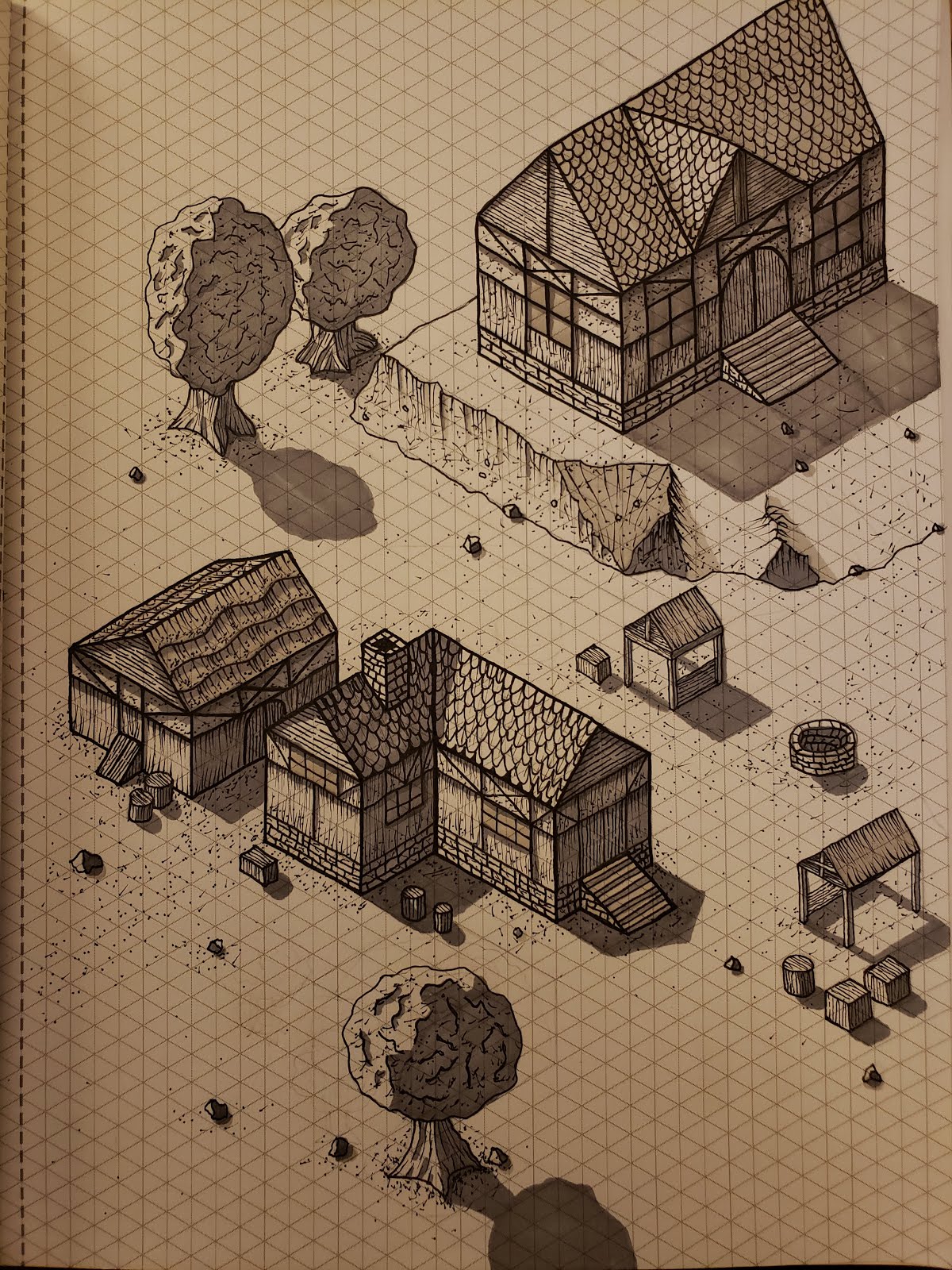
Some Other Examples
Here are some other maps that I have drawn with this technique with some different styles. The first extends the whole page and does not have the land edging. However it has some lakes and rivers which give it some character. The second is a smaller more simple map that I enhanced with photoshop. The third is cartoony, and I drew for a prototype board game.